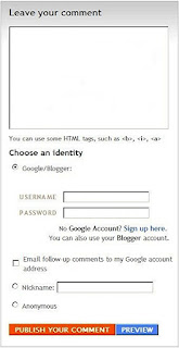
 If you forget all of the wonderful details on the card, etc., you either hit your back button, which means if you typed anything and forgot to cut it, it gets lost, or you say, "How beautiful," which isn't bad, mind you, but if you wanted to say something else it is lost somewhere, in my case, in la-la land.
You actually have 2 other choices you can now make so fellow bloggers have a much easier time of actually commenting on your creations. They are listed below:
Method 1 - POP UP WINDOW
Your blogger essentially gets the same thing as above, but in a separate Pop-Up window. When I get a Pop-Up window I first line up the image in the blog and then click on the Pop-Up again to bring it to the front. Then I drag it next to the card, etc., so I can look at the card while I comment. I have really preferred this in the past, and I am not sure about now, because now you also have:
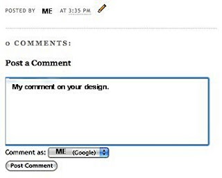
Method 2 - EMBEDDED COMMENTS UNDER YOUR POST
When the blogger clicks on the comments at the end of your post she/he brings up another page, but this time the post section is directly below your creation and any other comments that have been made (Just like Typepad and some other blog providers use). It looks like this:

Now, you may be asking, why do I care. First of all, I have a ton of blogs I love and follow. The faster I can comment, the faster I can travel on to the next one. I love looking and I probably wouldn't blog at all if I couldn't blog hop and enjoy other people's creativity. It is such a learning experience for me. Next, I like comments too. Last, but not least, I think there are more of me wanting to travel between comments faster and enjoy the visit longer, if that makes any sense!
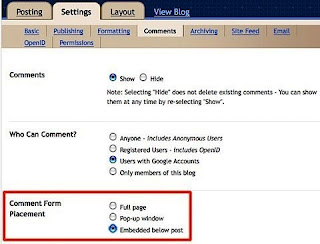
How do you CHANGE YOUR BLOG COMMENT CHOICE if you want to change it? Below is a picture of the area you need to access on your Settings Tab and instructions on how to do it. Below that are the steps.
 STEPS:
1. Go to your DASHBOARD
2. Click on the SETTINGS Tab
3. Click on COMMENTS Tab
4. Go down to the Comments Form Placement section as shown above with the red border and choose which ever type of comment service you want your blogging friends to have.
5. Last and VERY IMPORTANT - Go down to the bottom of the page and on the right hand side look for:

6. Click on SAVE SETTINGS before leaving the page.
Please do me one last favor before leaving today? Would you please vote in my poll on the right hand side bar at the top and tell me which type of posting you prefer. I've changed my for now to the last choice, but I am not sure if I prefer it over the second one. If you still have questions about how to do it (I am not always clear in instructions), please feel free to click on the EMAIL ME in the upper left hand side bar on this page and I will try to be of more help.
Thank you so much for stopping by 'the blog' to look and share.
Shirley

16 comments:
I didnt know they had this way of commenting! hmmmm...might have to give it a try too! BUT I voted for pop up, lol!
Thanks, Shirley...I didn't know I could format mine that way. You are not only very creative, but helpful too.
Thanks! I just changed mine into pop up.
Didn`t know I could change it! LOL Thank you :-)
I like the embedded form. I sometimes forget that I have a pop up window open LOL. Yep I quite often am in LaLa land as well!
thanks for sharing! I always liked that on others' blogs & didn't realize that's what it was on the settings! I changed mine!
You are so clever.
You are such a techie, Shirley!
Bet ya didn't know....I send people to your blog who email me with questions about just such things!!! You're quite a blessing!
Have a sparkly day!
Blessings, Maria
I'm a fan of the pop-up. Great tutorial, Shirley!
Thax for this info Shirley, I've now changed mine as well... hope people will like the change & find it easier to use
I'm a pop-up fan... I love moving the window close to the card and making my comment. Not the going back or scrolling up and down. I just find it easier for my mind as its short!! LOL! :)
Hi! I like to get the whole page up when I comment, and when I read the comments on my blog, but that's just how I like it... (So I didn't vote) :o)
I'll tell you about a little 'trick' you can do, when you are to click at a link, or to click to comment, or any clickable thing on the internet, press your SHIFT key at the same time as you click on the link, it will then open on a new page, and you'll still have the initial page under it. I think this is a great thing to do when I look in galleries, like at the Two Peas... :o)
(Hope you understand my English...)
This is really helpful! I've been debating on this very subject, and you have helped me make up my mind! Thanks so much! Best, Curt
I have to say that the pop up window is the fastest for me to get from one blog to the next and if I want to comment on something else on the blog...I don't have to worry about scrolling all the way back to the top to go back to the main page again. I can just close the pop up window. Does that make sense?
WOW! I love the little bit of info that you just gave us. I am going to definitely change my settings, because I like to cruise through blogs quickly as well!
Have a great day!
Vicki
Ohh this is so very helpful!!! I definitely like this embedded method better!!
Thanks for the blog info Shirley! I'm still a newbie to it all, and a techno dork to boot!
Beth
Post a Comment